Imagine this scenario—a potential customer makes it your website. You offer everything they are looking for. Yet, once they arrive on your landing page, they become overwhelmed by information and decide to give up. This problem is all too common.
In fact, a study by Chartbeat in 2014 found that 55% of website clicks result in a time on site less than 15 seconds. That’s barely enough time to let the page load and take a quick scan of the information.
In the past, search engines would reward longer pages that used the target keyword multiple times, with better rankings. Today, the use of the target keyword on the page is less important and there is little to no advantage to a longer page over a shorter one. The longer pages leave potential customers scrolling through boring, and sometimes unnatural, text.
What Can You Do Better?
Before we delve into our tips for how some changes to your website text and formatting can help improve your page engagement, there’s one key thing to keep in mind. You need to understand your audience before you can carry out any successful changes to your copy.
As a business owner, you are the expert in your field and the #1 fan of your own business. Most people that come to your website aren’t interested in reading self-promotional text and complicated information. Instead, they want to know:
- You understand their need.
- You offer the services they need.
- You have the experience to back up your services.
- You are available to provide your services in the immediate future.
Adjusting your text is one way to better connect with your audience, but’s it’s also important to consider the visual aspect of a website. You don’t necessarily have to improve your message, but improve the way that message is conveyed to others. Incorporating photos, videos, and other media are great ways to break up text and better engage your audience. However, you need to make sure you don’t give your audience too much to look at, as it just confuses your message and distracts from the purpose of your page.
Now, let’s talk specifics.
Split Content Into Small Sections & Utilize Headings
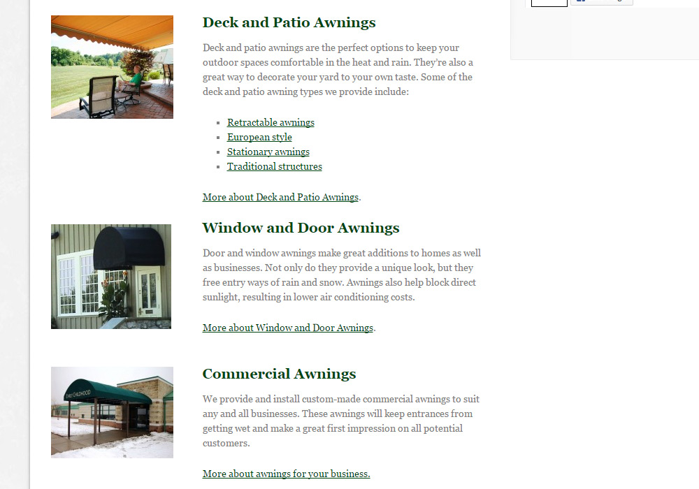
How to Implement: Next time you write content for your website, take a second to understand where the content could be split up. Adding simple headings to different sections with a different font size helps the reader’s eye to focus on the main points and better digest the information.
Use Short Sentences
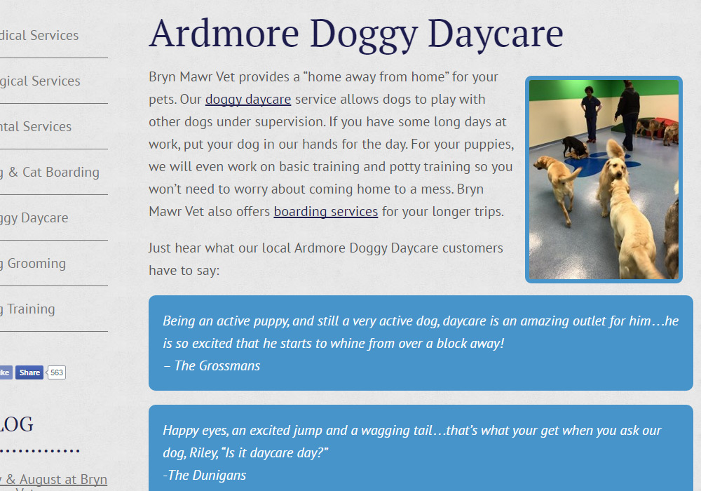
How to Implement: After you write out the content you want, review it as though you were an editor. Eliminate sentences you don’t need. Split sentences that drag on into two different ones. Break up different ideas into new paragraphs (and feel free to create new headings).
Implement Bullet Lists
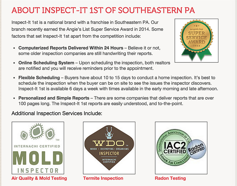
How to Implement: If you see a lot of commas on the page, that’s your hint that you might be able to turn a few lines of text into some bullet points. Oftentimes, bullet points are helpful to use when talking about the benefits your company offers or the points that set your business apart from others. Otherwise, if that’s stuffed in a paragraph, the reader might just skip it.
Motivate Action
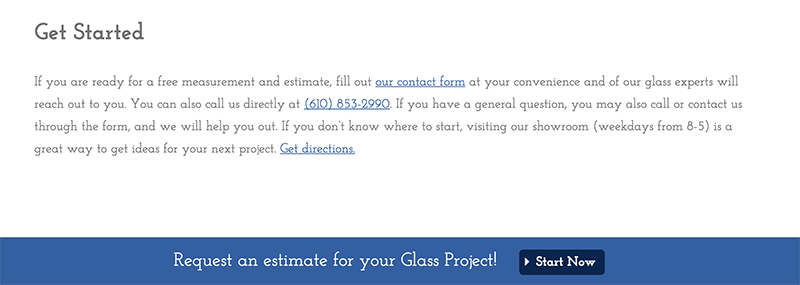
It’s not about just about having a call-to-action on the page, it’s about having a clear call-to-action that isn’t just “contact us.” A lot of generic forms leave the visitor wondering what the next step is after “contact us.” It’s better to use a form that is a little longer and makes the visitor feel like they are on a clear path towards what they are looking for.
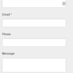
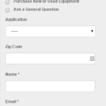
Below, you’ll see a basic contact form we had used on a client’s site. We went ahead and recently updated this form to include some more options. This gives the person filling out the form more options and also gives the business some better information before they follow up with a lead. Take a look at the changes:
- Before
- After
How to Implement: Creating a call-to-action requires a little more work than some simple text changes. If you are working with an agency or web company, you should talk to them about implementing a form or button on your site that will encourage potential customers to reach out. As the business owner, you might have a better idea of the best way to convert your customer.
You might also consider setting up an opt-in offer, where someone who visits your site will give you their email in exchange for a special offer or exclusive document.
Get Started
Updating your landing page formatting isn’t something you can do overnight, and it can take a long time to determine the best strategy that fits your business. It’s a process that really starts with you understanding the problems your customer faces. Effective landing pages identify your clients’ needs, then qualify your business as the best solution for those needs.
While you might not be the one updating your website, you are the one who knows your business. You deal with customers daily and understand the solutions they are looking for. That’s why it’s important to share this type of information with the website company you work with.
Of course, you should always trust the website experts, but it’s helpful for them to have clear insight into your business in order to create a clear strategy for converting customers.
